sass mixins that are way too good
Table of contents
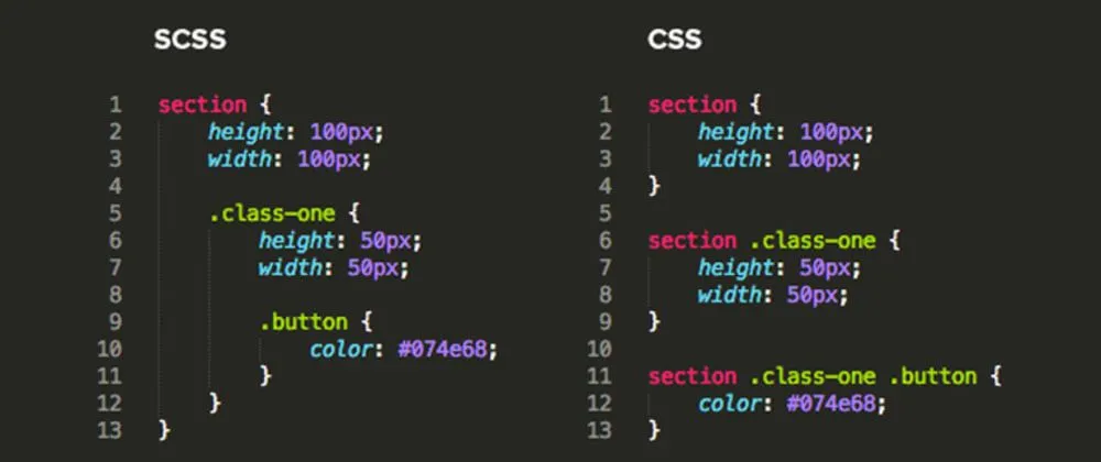
🢒Click to expand!
All sass font weights:
$font-weights: (
  "thin": 100,
  "extrlight": 200,
  "light": 300,
  "regular": 400,
  "medium": 500,
  "semibold": 600,
  "bold": 700,
  "extrabold": 800,
  "black": 900,
);
Usage
.selector {
  font-weight: map-get($font-weights, thin);
}
Add CSS vendor prefix:
@mixin prefix($declarations, $prefixes: ()) {
  @each $property, $value in $declarations {
    @each $prefix in $prefixes {
      #{'-' + $prefix + '-' + $property}: $value;
    }

    // Output standard non-prefixed declaration
    #{$property}: $value;
  }
}
Usage
.selector {
  @include prefix(
    (
      column-count: 3,
      column-gap: 1.5em,
      column-rule: 2px solid hotpink,
    ),
    webkit moz
  );
}
Breakpoints
$bp: (
  mobile: 480px,
  tablet: 768px,
  desktop: 1440px,
);

@mixin query($display) {
  @each $key, $value in $bp {
    //  defining min-width
    @if ($display == $key) {
      @media (min-width: $value) {
        @content;
      }
    }
  }
}
Usage
.selector {
  display: flex;
  @include query(mobile) {
    flex-direction: column;

    // you can pick any value you wish.
    height: 500px;
  }
}
Conclusion
SCSS mixins are reusable blocks of code that allow you to define a set of CSS rules that can be included in multiple places throughout your stylesheets. They help avoid repetition and maintain consistency by letting you create modular, maintainable styles. Mixins can accept parameters, enabling you to customize the styles dynamically based on different inputs. This flexibility makes it easy to apply complex or commonly used styles across different components without duplicating code, ultimately leading to cleaner, more efficient stylesheets.